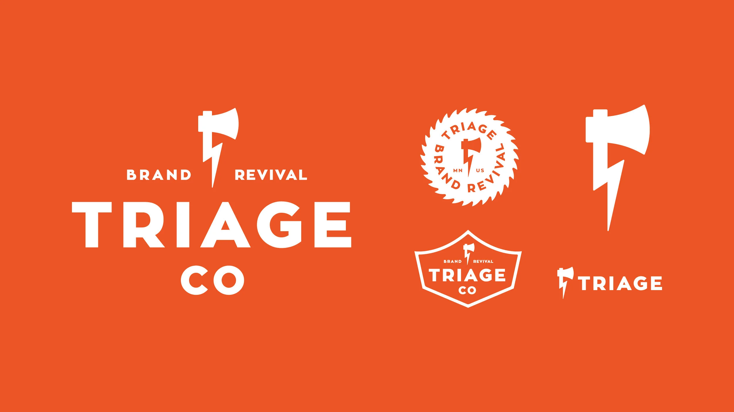
TRIAGE
It’s quite an honor when you’re asked by another creative agency to create their branding and identity. Triage was looking for a mark that made their name a bit more playful rather than serious. The mark is a combination of an Ax which represents the intensity and force in which they attach their projects combined with a lighting bolt representing the energy they add to the brands they interact with.